Bidaye ENT Surgery
From a general-clinic template to a custom, AI-built brand that shows what he really is: a specialist in the voice, swallowing, thyroid and neck.
Working with Abhishek on the rebranding and redevelopment of my ENT surgery website has been a genuinely rewarding experience.
 Mr Rohan BidayeConsultant ENT Surgeon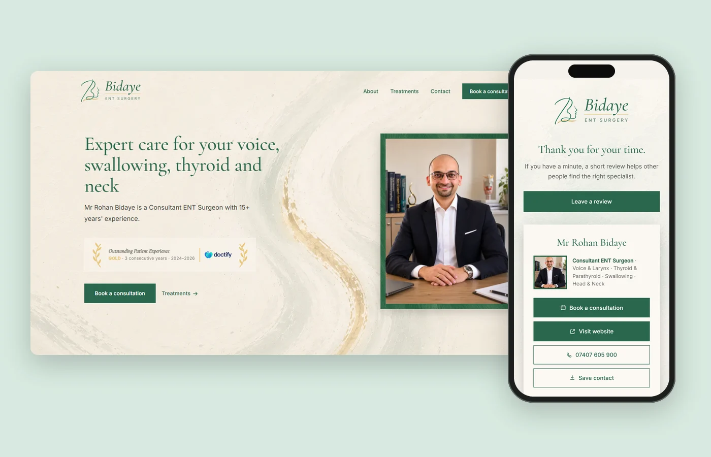
At a glance
- The challenge
- A specialist surgeon with an off-the-shelf logo and a template website that read like a general ENT clinic.
- What I did
- Built a brand that could only be his, from one of his own paintings, then mapped the patient and GP journeys that shaped the website, the copy and a one-scan QR code on paper.
- The result
- A practice that now looks and reads like the specialist he is, and looks like no other clinic online.
The challenge
A Rare Specialist, Off the Shelf
Mr Rohan Bidaye is a consultant ENT surgeon in Northampton. He specialises in the voice, swallowing, the thyroid and the neck, and is fellowship-trained in laryngology, thyroid and head and neck surgery. Skills like his are rare.
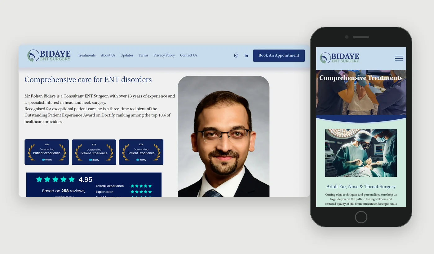
His logo and website were off the shelf. The site came from a Squarespace template, and the logo could have belonged to any ENT clinic. Neither said "specialist", and that caused four problems.
- WebsiteOne long page, every treatment given equal weight, and no easy way to reach his specialist areas.
- BrandA generic domain, entsurgery.org, and a look that could belong to any clinic.
- PositioningThe headline said "Comprehensive care for ENT disorders": a general clinic, not a specialist.
- ReviewsHe needed more patient reviews, and there was no simple way to leave one.
The brief
Rebuilt, But Whose?
It needed a rebuild from the ground up, and the rebuild had to be uniquely his.
That is harder than it sounds. AI got the early explorations moving quickly, but they could have belonged to any clinic. Line up enough surgeons' websites and they blur into one: white walls, blue scrubs, operating lights.
AI can rebuild it too. It would look like anyone's.
It needed a personality, and that had to come from him.
Inspiration
It Began With a Painting
Then painting came up. Mr Bidaye has painted for years, moving between watercolour, acrylic and abstract work. He has drawn the connection himself:
"Both painting and surgery require patience, precision and a steady hand. Perhaps that's why the two have always felt closely connected to me."
One of his canvases had everything the brand needed.
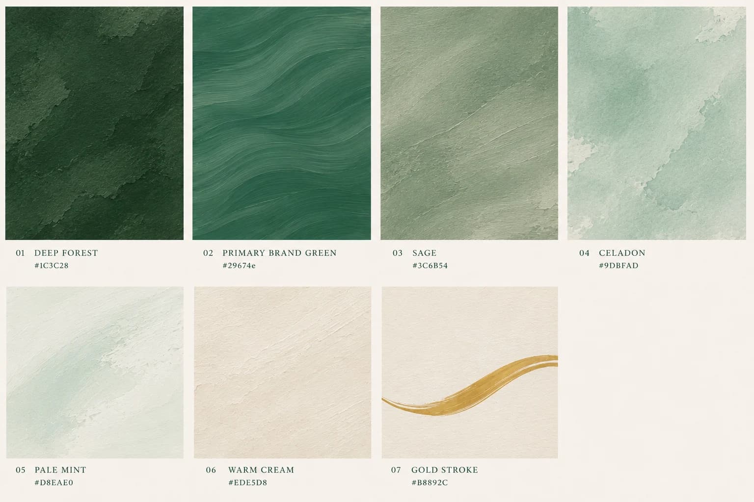
Soft mint. A deep forest green. One long sweep of gold.
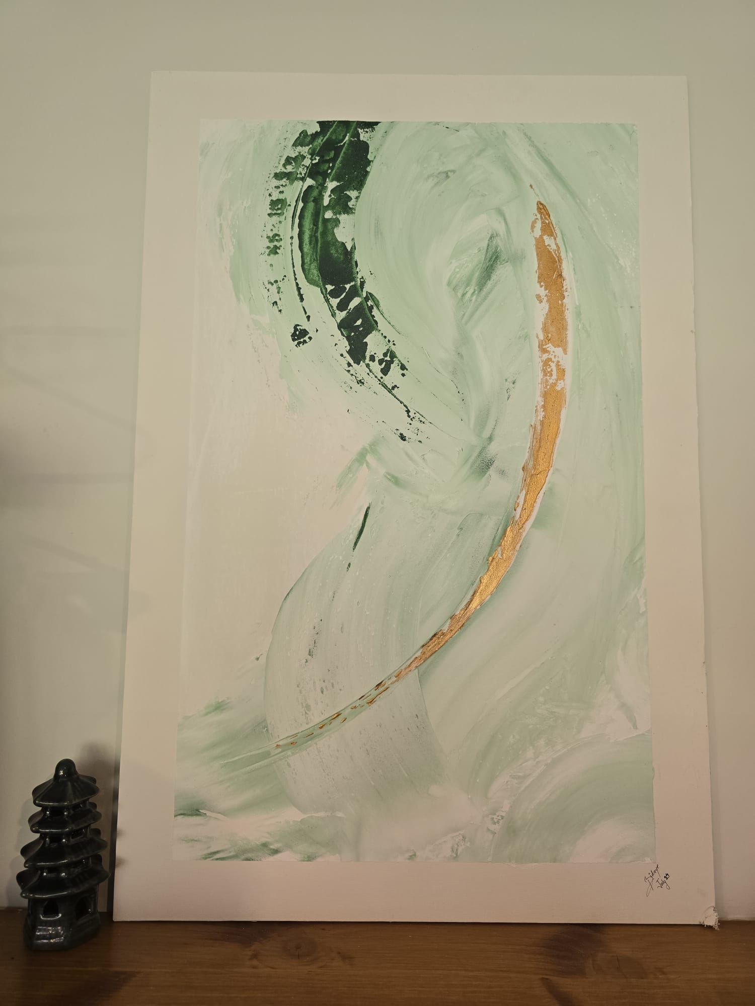
So that painting became the brand. The palette came straight off the canvas, and the gold stroke travels into the logo, the website and the stationery. I'd love to say this was the plan from day one. It was not.
- Warm Cream#fffcf8
- Pale Mint#d8eae0
- Forest Green#29674e
- Champagne Gold#e8c77c
One of the most interesting aspects of the project was how he incorporated my personal interest in painting into the visual identity of the practice, giving the website a character that feels both professional and personal.
The logo
One Line, One Stroke
His signature became the mark: a single-line B that doubles as a face in profile, with the gold stroke sitting under his name.
Less a logo than a signature.
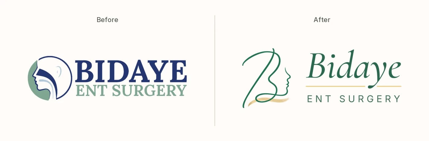
A face in profile, ENT at a glance. The one idea worth keeping.
The B is his own signature, drawn as a single line whose curve becomes the face in profile. Beneath it, the gold stroke follows the line of the throat, a quiet signal of a voice made clear and strong, and the same gold sits under his name.
Brand artwork
Everything, Painted
Once the painting set the tone, nothing in the brand was allowed to look digital.
With AI, one canvas grew into a whole painted world. AI work usually shows: glossy, generic, interchangeable. This doesn't, because every piece started from his painting rather than from an average of everyone else's.
- TexturesOne for every brand colour, brushed in the same hand as the original.
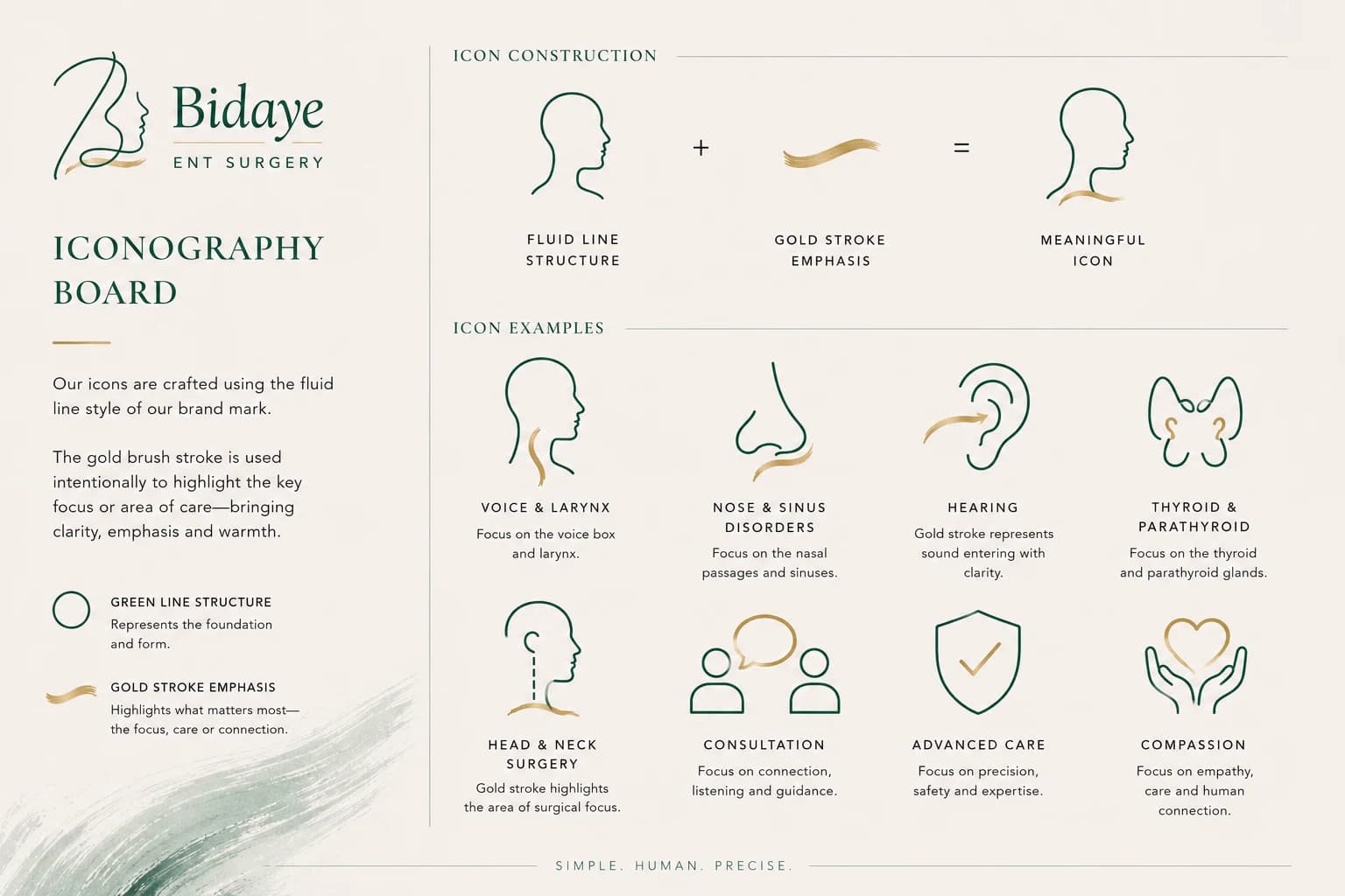
- IconsDrawn as a single fluid line with one stroke of gold, like ink lifted straight from the logo.
Made with AI. Unmistakably his.
What impressed me particularly was his ability to bring fresh, creative ideas to the table rather than simply working to a brief.
Medical illustration
Anatomy, Drawn Gently
Anatomy is where the old site and the new feel furthest apart.
Drawn, not photographed.
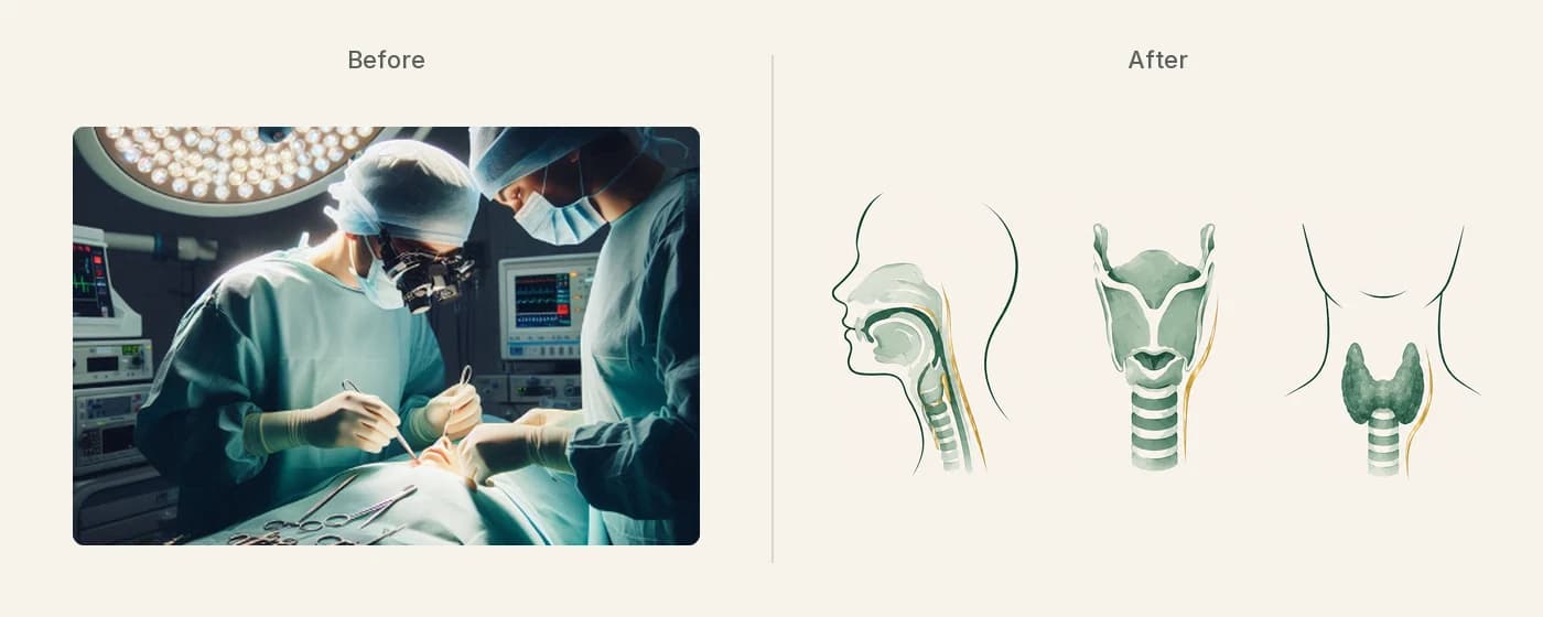
Operating-theatre photographs. To a surgeon, an ordinary Tuesday. To a patient worried about a lump in their neck, the image they can't unsee.
Fine line, soft watercolour and a single touch of gold: clear enough to explain a condition, gentle enough to hang on a wall.
UX & content
Built for Two Readers
The look was half the job. The other half was making the site work for the people who use it.
Before designing a single page, we mapped who comes to the site and what each of them needs.
- A nervous patientWants calm, and a clear way to book.
- A referring GPWants to trust him within seconds.
Those two journeys shaped every page and all the copy. That makes this UX work as much as design: deciding what each reader sees first, what they need next, and how few steps it takes to get there.
From the outset, he took the time to understand my practice, my professional identity and what I wanted the website to communicate to patients.
It all rests on one idea.
Calm Intelligence.
"I feel safe in capable hands." Not: "This is an elite prestige surgeon."
The website
A Website With No Template
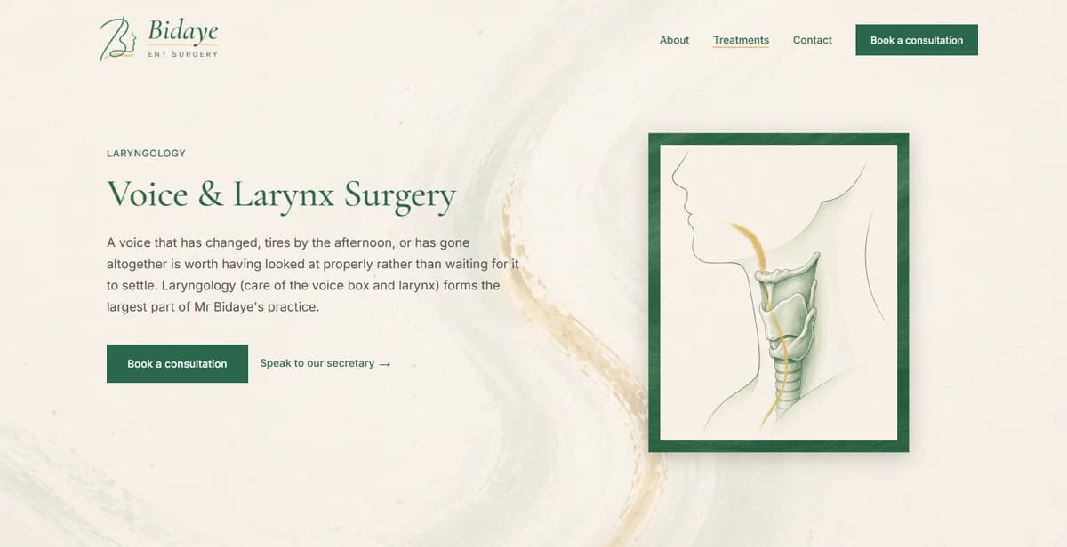
bidayeentsurgery.com was coded from a blank page with AI, and every page carries the brand. No borrowed blocks, so the structure could follow his expertise and the two journeys: his specialisms up front, booking always close at hand.
- His textureThe painting's texture moves behind every page.
- His four areasThe hero reads "Expert care for your voice, swallowing, thyroid and neck".
- A page eachEvery specialism has a page of its own, written for a patient and clear enough for a GP.
He combines a strong creative instinct with technical expertise and a genuine enthusiasm for what he does.
Print & reviews
Paper Worth Keeping
The brand carried onto paper: a letterhead, a business card, and one QR code.
Every piece of paper leads back to one place.
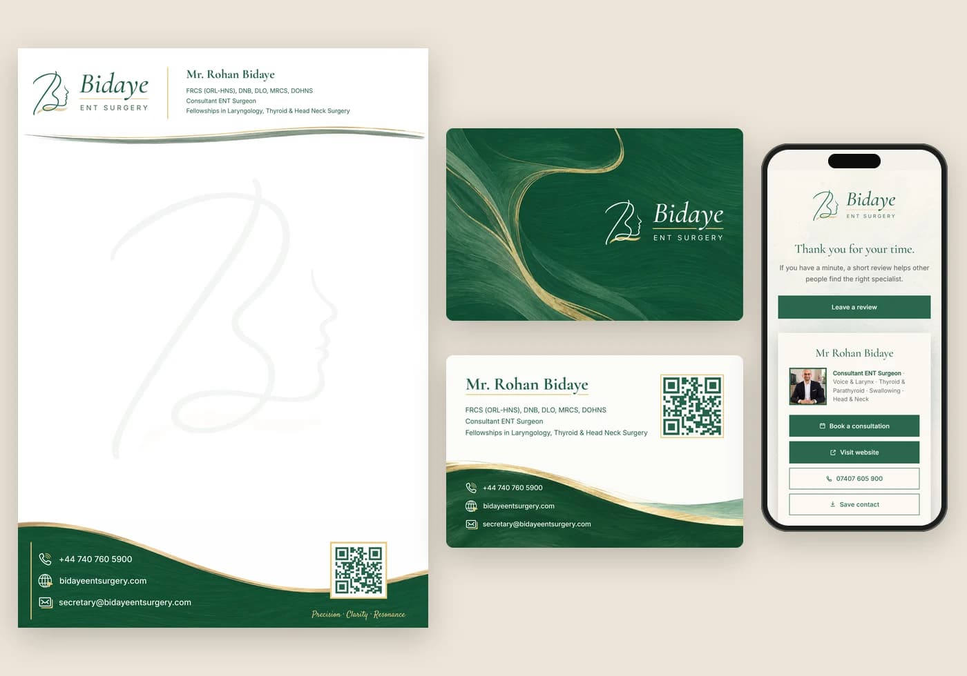
His signature B sits behind the page as a watermark, with the painted green footer carrying his contact details and a QR code.
The front is the painting itself, edge to edge with its gold stroke. The back keeps his name, credentials and details, with the same QR code.
He needed reviews, and there was no smooth way to get them. Now one QR code takes patients to a single page where they can book, save his number or leave a review.
The outcome
The Finished Canvas
Live since September 2026, with the old domain redirected in.
A patient searching for a hoarse voice or a thyroid nodule now arrives at a specialist, not a general clinic. A GP deciding where to refer sees the same thing within seconds.
Built with AI, yet nothing about it feels machine-made. It carries his personality, because it began with his painting.
I've worked on a fair few brands. I didn't expect one of them to turn into actual art, and I definitely didn't expect it to be for a surgeon.
A surgeon who paints, with a brand that finally looks like one of his canvases.
Work like this also helps me keep building EcoFlyp.
I'm delighted with the final result and would happily recommend him to anyone looking for someone who can bring fresh thinking, creativity and a collaborative approach to a project.
Working with Abhishek on the rebranding and redevelopment of my ENT surgery website has been a genuinely rewarding experience.
From the outset, he took the time to understand my practice, my professional identity and what I wanted the website to communicate to patients. What impressed me particularly was his ability to bring fresh, creative ideas to the table rather than simply working to a brief.
Abhishek is extremely proactive, thoughtful in his approach and, importantly, very receptive to feedback. We went through several iterations of the design, and throughout the process he remained patient, engaged and willing to explore different directions. He was never short of ideas, but equally understood the importance of listening and adapting them to reflect my vision.
One of the most interesting aspects of the project was how he incorporated my personal interest in painting into the visual identity of the practice, giving the website a character that feels both professional and personal.
He combines a strong creative instinct with technical expertise and a genuine enthusiasm for what he does. I'm delighted with the final result and would happily recommend him to anyone looking for someone who can bring fresh thinking, creativity and a collaborative approach to a project.
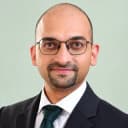 Mr Rohan BidayeConsultant ENT Surgeon
Ready to explore the live results?
Start with a free BrandDNA, or tell me what you are building.